In this release, Cognos Analytics 11.1.6 contains a couple of exciting makeovers which we will cover from a redesigned online intuitive learn system, redesigned Carbon Design System Logos and User interface plus a great redesign and reorganisation of the Dashboarding UI.
11.1.6 ‘isn’t going to be the final 11.1 family release. It is expected that by mid-year 11.1.7 will be released with newer functionality and UI improvements but will be declared the LTS (Long Term Support) release. This means that fixes will continue to be supplied by Fix Central for 11.1.7 for around 3 years.
Anyway, let’s get into the new stuff….
New Learn System
With this release, the entire help system has been replaced with a brand new ‘Learn’ pane. It’s in the usual location (top right) but now intelligently gives you information relevant to the part of the product that you are currently using. When you click the ‘?’ Icon on the toolbar the Knowledge Center opens with content relevant to you. By entering a phrase in the search box, you are shown relevant content to your search. The examples below show the initial screen when in Team Content and the results from a search on custom visualisations.
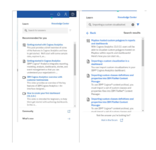
The content returned is a mix of Knowledge Center articles, Embedded YouTube Videos and associated IBM and community content. You even can access the Community Forum from within the software itself. One neat feature within this is the videos play within the learn pane so you can easily follow the instructions step by step on your system on one screen. A handy addition.
abc
Refreshed User Interface
As part of IBM’s strive for a consistent look and feel for all their software, an open-source design project has been commissioned called ‘Carbon Design System’. Details of the open-source UI project can be found here.
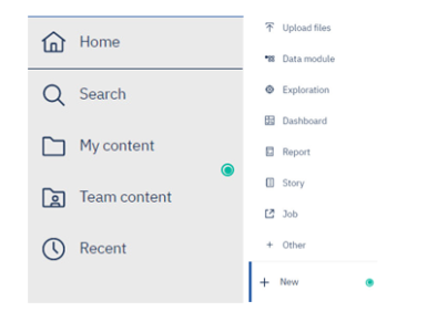
As part of this, Cognos Analytics has received a refresh of Icons and typefaces. Examples of the new look can be seen below.
While many will question the value of the UI refresh, bringing consistency to the look at feel of all tools will aid adoption and training because we will all visually recognise the options through the iconology just like we do with Microsoft Office today.
The CDS overhaul is also taking place on Planning Analytics as well with a view to converge the two toolsets in the medium term.
Dashboarding
One of my main criticisms of Dashboards in previous releases has been the inconsistency of menus appearing within the Dashboards module, where is the context menu going to appear now was often the main complaint. However, this release has seen a bit of a redesign of the Dashboard module, and the changes are a very welcome improvement.
So, let’s look at the four main areas highlighted below:
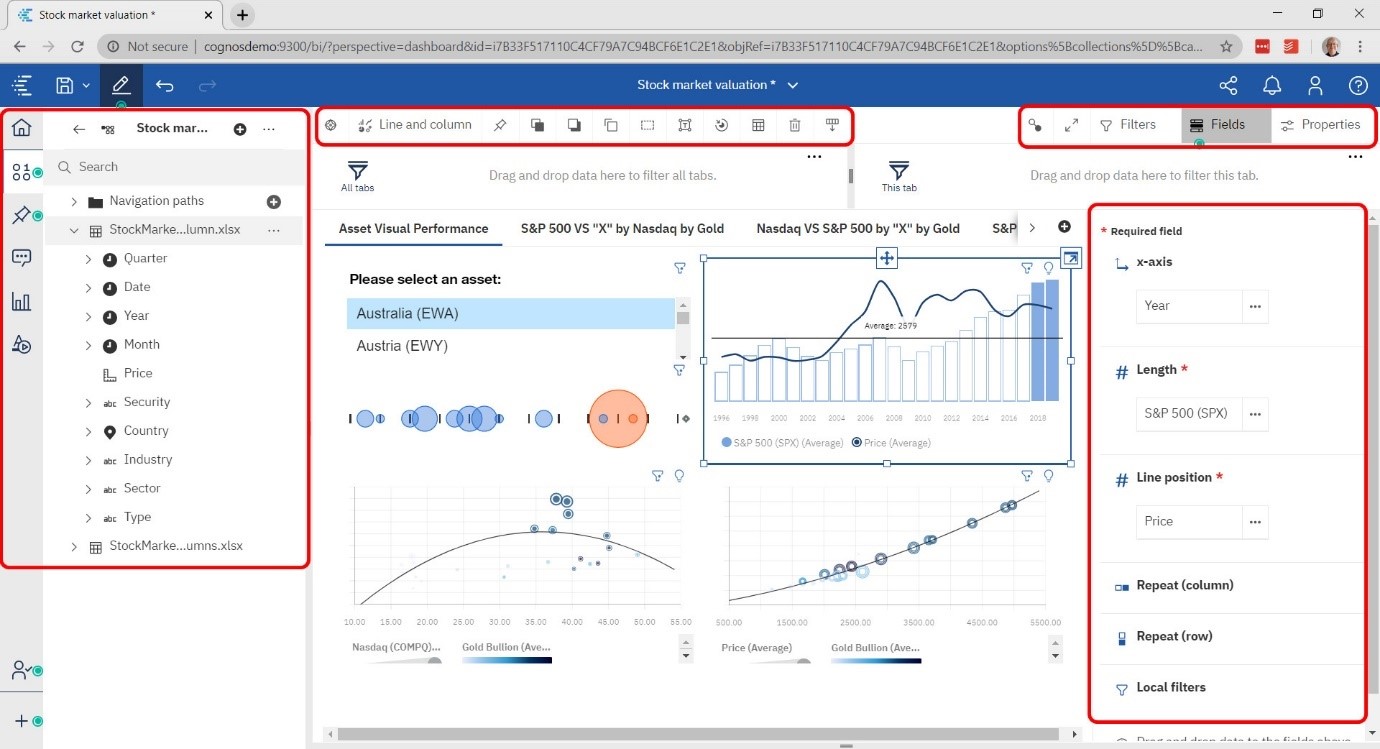
Side Menu and Metadata Tree – New Icons and a slight redesign to the data tree mean improved navigation.
Visualisation Properties – These now appear t the top of the screen rather than somewhere in the middle. The toolbar can be undocked if you wish, but I like it up there out of the way.
New Fields and Properties Context – Top right of the screen allows you to show filters, fields and properties with pop down options for each. A nice redesign feature to ensure maximum screen space is available at any one time. Full Screen and View Widget Connections are also available in the context menu.
Properties and Fields Details – On the right is the details behind your choice of fields, properties etc from the Context menu. Use of space has been thought through well here with collapsible menus of properties wherever possible.
Crosstab Nesting in Dashboards:
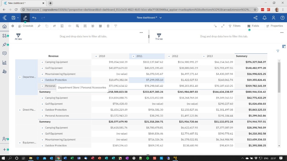
One of the best new features in Dashboards is the nesting feature within Crosstabs. Only available in Dashboards and at present only available for Dimensional data sources but the capability to nest multiple different dimensions with automatic expand and collapse is very well received.
The example below I constructed from the samples showing two dimensions (Retailer Type and Product) in the rows with Date in the columns and the Revenue measure. It’s easy to create, easy to understand and finally might we just have seen something to replace the evergreen PowerPlay Studio!!!
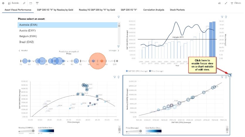
Improved Visualisation Focus:
In previous releases, we used focus mode to bring a visualisation to the front of the screen so we could work on it. However, there was still a potential issue with busy dashboards with lots of content and being able to see enough detail in the visualisation to make it useful. In this release, the functionality for focus mode has been brought into the user experience providing focus mode as a full-screen alternative allowing you to pop out a visualisation for close inspection and then put it back again.
Other smaller improvements have also been made to Dashboards, to keep this article to the most impactful features you can find full details in this excellent article written by Matt Denham at IBM.
Reporting
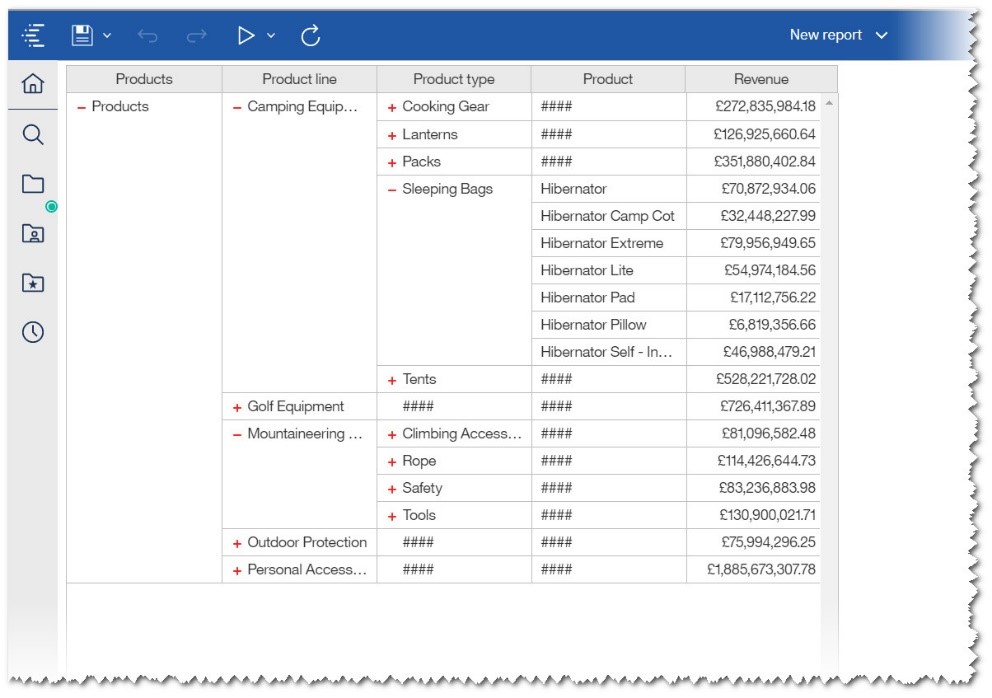
While reporting has not received as many improvements as Dashboards, I must highlight a brand new feature called the ‘Data Table’.
The Data Table is like a list object but with interactivity, filtering, expand and collapse. The data is queried and brought back to the browser, so interacting with it is fast and easy.
In the example below, I have used the samples over the Product Dimension to show the expand / collapse capability. You can start with it fully expanded or totally collapsed.
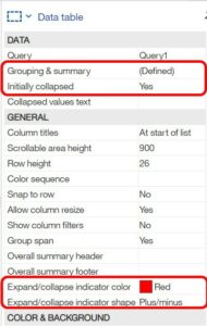
In terms of setup, there are several properties on the Data Table that you can set to get the interactivity working straight away, these are illustrated here:
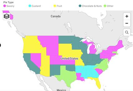
The other reporting feature of note is ‘Categorical Map Colouring’. IBM has made great strides during 11.1 to bring the mapping capabilities closer to their rivals, and by adding this feature, it gives a welcome improvement to that functionality.
A compelling use case is to use different colours for different regions categorically, such as the example showing below. This is a great way to group geographical locations. To use this feature, authors can simply drag categorical data onto the Colour slot in a map visualisation.
While on the subject of maps, previously erroneous longitude and latitude data in maps were rendered as 0,0. From this release onwards that will no longer be the case, and a warning will appear on the map stating that some data could not be plotted.
Other smaller improvements have also been made to Reporting, to keep this article to the most impactful features you can find full details in this excellent article and online demonstrations by Rachel Su an Offering Manager at IBM.
Data Modules
The previous two releases (11.1.4 and 11.1.5) have seen some great improvements in Data Modules capabilities. This release is a lot quieter on new functionality but makes up for it with some advantageous time-saving features for the developer.
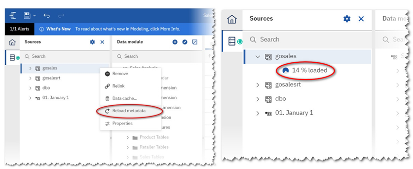
For example, to refresh metadata after you added a column to a table involved visiting quite a few screens to ensure that the data was refreshed. Now you can simply do that directly from within the Data Module interface as shown below.
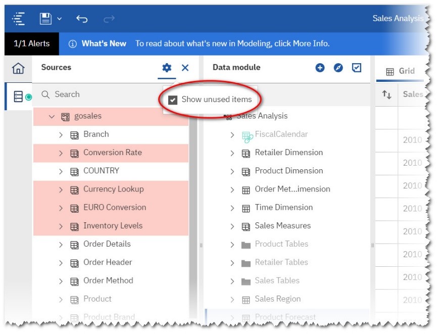
Once you have reloaded your metadata you can easily see what is used and what isn’t by selecting the checkbox below. All unused tables and fields are shown in pink.
Lastly, you now can drag individual fields into the Data Module by dragging and dropping from the ‘source’ panel into the Data Module. Previously, the whole table needed to be brought through.
All in all some really useful additions for the developer.
As well as the Data Module enhancements, please take a few minutes to look at this article from Offering Manager Mohammed Omar-Khan on Watson Knowledge Catalog Integration here.
AI and Advanced Analytics
In this release, AI learning now tracks the kind of visualisations you like. For example, if Cognos Analytics recommends a bubble chart and you keep changing it to a line chart, then the AI learning will remember this and start to use your preference when putting visualisations onto the canvas. The key thing to remember is those learnings are only committed when you save a dashboard, story or exploration. It doesn’t learn your reporting preferences…. yet!
AI Learning is ‘user specific’ so it will track your personal preferences. By default, it’s enabled but you can turn it off in your personal preferences.
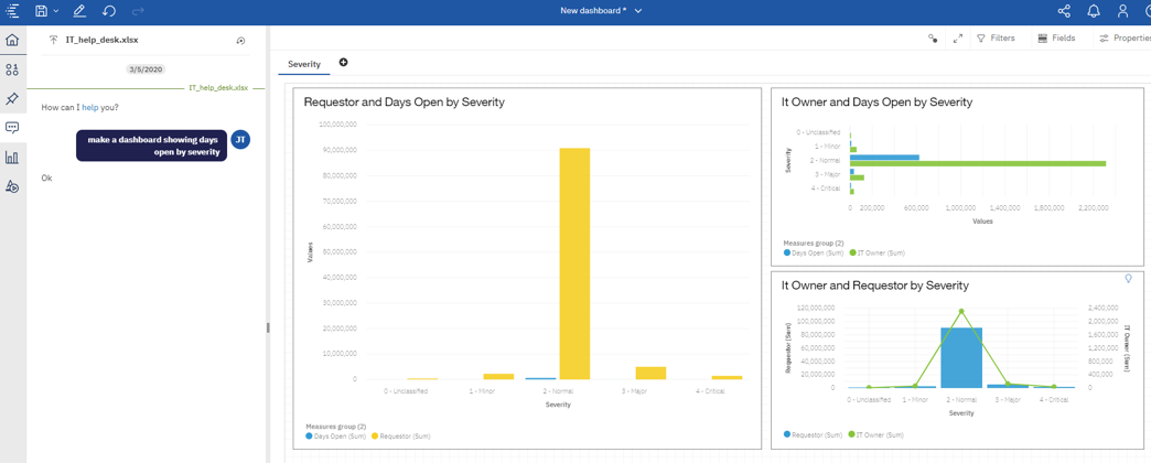
Going back slightly to Dashboards, AI has now been built into the Dashboard capabilities. You can ask the assistant to build you a dashboard as below, and it will create something ‘of interest’.
However, as a consultant myself, I am not sure how useful this is. Perhaps its early days but during my testing of this, I got some mixed results. Perhaps playing with real data instead of samples will change my view.
On the exploration side, stand-alone calculations are now supported as a point of interest for decision-tree, spiral, and driver analysis visualisations. This helps somewhat when you have spent time creating known metrics in your metadata layer, and you want to use them like you could use a ‘raw measure’ like Revenue.
Finally, from the functionality perspective, the Exploration Time-Series visualisation now contains time series natural language insights.
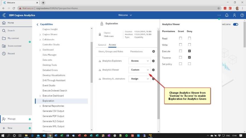
However, I have deliberately left the best until last here. IBM has announced that the Exploration capabilities have been made available to ‘Analytics User’ licenses. Previously, this was restricted to Analytics Explorer licenses only but now the main body of your user community can start to use the exploration studio capability.
In order to activate this, you will need to change the capability settings in the Manage People Section. If you are upgrading from an earlier release of Cognos Analytics then you need to change the ‘Exploration’ capability of your Analytics Viewer role to ‘Access’ instead of it being specifically ‘Customised’ as a Deny Access.
Details and further examples of Advanced Analytics can be found in Offering Manager Jason Tavoularis’ article here.
Notebooks
In terms of Jupyter Notebooks, the major improvement here is that they now support ‘R’ as a programming language. Previously, this was limited to Python but now that ‘R’ is supported this means that more Data Scientists can use Notebooks to create content outside of traditional IBM Cognos content for use inside IBM Cognos.
Kasun Attanapola has written an article detailing the R support in Notebooks which you can access here.
Closing Comments
In summary, I believe 11.1.6 is a very solid balance of new features and improvements to usability. As a report user, I like the new data table, and as someone who has used all the legacy tools over the past 20 years, I am particularly excited to see the nested crosstab functionality in Dashboarding. Much as I love PowerPlay, its time has passed, and we need to move on. This might be that moment. The Dashboard UI redesign is also well received by me and offers a much cleaner interface and experience.
Data Modules have some time-saving improvements which will be well received by developers. However, we still strive for that developer functionality for dimensional structures in Data Modules to really push Framework Manager and Cube Designer over the hill.
During testing whilst writing this article I have found the release to be solid and performant. Give it a try, I would love to hear what you think.

Listed in:
- Cognos Analytics