


POWER BI: New Release – String Conditional Formatting
The new release of conditional formatting for string fields in Power BI had a positive impact on the user experience. Prior to this update, users were limited in their ability to format string fields in their reports, especially when using column charts and bar charts. With the new release, users now have more flexibility and control over how string fields are formatted. This makes it easier to highlight important information and improves the overall readability of their reports.
In addition to conditional formatting, the new release also allows users to apply formatting based on data bars, color scales, and icons. This provides users with additional visual cues to help them quickly understand and interpret their data.
Overall, the new release of conditional formatting for string fields in Power BI has made it easier for users to create visually appealing and informative reports. It has given users more control over how their data is presented, making it easier to spot patterns and trends, and ultimately helping users make better-informed decisions.
How to apply conditional formatting to string fields in Power BI!
POST NEW RELEASE
In the past, applying a conditional format to a string field in Power BI was not straightforward – especially when dealing with table visuals.
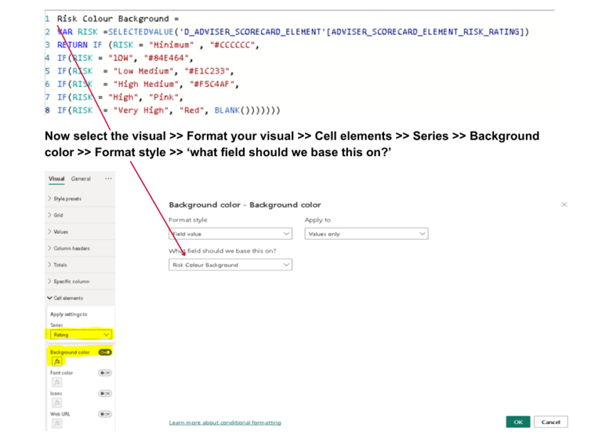
However, DAX was used to provide a workaround (Using IF statement or SWITCH function) and format style >> ‘Field value’ >> then select the measure you created >> click ‘ok’. This automatically applies the colours stated to the fields. An Example as shown below:
The Measure:
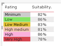
The Result:
NEW RELEASE
Now in the new feature released last month (Feb.2023), string conditional formatting in Power BI is a lot easier and straightforward without the use of DAX.
“We know that many users have been asking for this feature, so Microsoft are excited to be bringing you this feature and hope you find it a powerful new conditional formatting capability.”
Conditional formatting in Power BI allows users to apply formatting rules to visual elements based on specific conditions. This can be very useful when trying to highlight important data or when trying to draw attention to specific trends or patterns. In order to apply conditional formatting to string fields in Power BI, we need to follow a few simple steps.
Step 1: Create a visual element
The first step in applying conditional formatting to string fields in Power BI is to create a visual element that we want to format. This could be a table, a chart, or any other visual element that displays data.
Step 2: Add the string field to the visual element
Next, we need to add the string field that we want to format to the visual element. This can be done by selecting the field in the Fields pane and dragging it onto the visual element.
Step 3: Click on the visual element
Once the string field has been added to the visual element, we need to click on the visual element to select it.
Step 4: Open the Formatting pane
With the visual element selected, we need to open the Formatting pane by clicking on the paint roller icon in the Visualizations pane.
Step 5: Select the conditional formatting option
In the formatting pane, we need to select the conditional formatting option by clicking on the data bars icon.
Step 6: Choose the string field
With the conditional formatting option selected, we need to choose the string field that we want to format from the dropdown menu.
Step 7: Choose the formatting rule
Once we have selected the string field, we can choose the formatting rule that we want to apply. This could be a color scale, a data bar, or any other formatting option that is available.
Step 8: Choose the formatting options
Finally, we need to choose the formatting options for the formatting rule that we have selected. This could include choosing the color scheme, the minimum and maximum values, and any other options that are available.
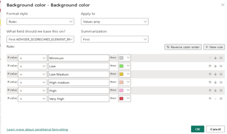
Now select the visual >> Format your visual >> Cell elements >> Series >> Background color >> Format style ‘Rules’ >> search the field name >> fill in the ‘IF statement rule’.
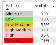
The Result:
By following these simple steps, we can apply conditional formatting to string fields in Power BI. This can be very useful when trying to highlight important data or when trying to draw attention to specific trends or patterns. With Power BI’s powerful conditional formatting options, we can create visually stunning reports and dashboards that make it easy to understand complex data.
Also, When it comes to applying conditional formatting to string fields in Power BI, there are both pros and cons to consider.
PROS:
- Highlight important information: Conditional formatting can help you to highlight specific data values that are important or require attention, making it easier to focus on key information and take action accordingly.
- Improved readability: By using conditional formatting to visually differentiate between different values in a string field, you can improve the readability of the data, making it easier to understand and analyze.
- Quick identification of trends: Using conditional formatting, you can easily identify trends in your data, such as which products are selling the most or which regions are experiencing the highest sales growth.
CONS:
- Overuse can be distracting: If you apply conditional formatting to too many values or fields, it can become visually overwhelming and distracting, making it difficult to focus on the most important information.
- Potential for bias: The use of conditional formatting can potentially introduce bias into your analysis, particularly if the formatting choices are subjective and influenced by personal preferences or assumptions.
- Complexity and maintenance: Conditional formatting can be complex to set up and maintain, particularly when dealing with large amounts of data or complex rules. It can also slow down the performance of your report or dashboard if applied too extensively.
Overall, conditional formatting can be a useful tool when applied thoughtfully and in moderation, helping to enhance the visual presentation of your data and highlight key insights. However, it is important to consider the potential drawbacks and weigh them against the benefits before applying them to string fields in Power BI.
Ayo Oludare is a highly skilled data analyst and data visualization expert with extensive experience in M code, Cognos ReportNet, SQL Server Reporting Services (SSRS), Microsoft Excel, Microsoft Power BI, and DAX. Ayo’s strong background in data analysis and problem-solving makes him a valuable asset in any data-related project.
Ayo has a proven track record of using M code to transform and manipulate data effectively. He is skilled in using Cognos ReportNet and SSRS to create complex and dynamic reports. Ayo is also highly proficient in using Microsoft Excel and Power BI for data analysis and visualization.
Ayo’s expertise in DAX enables him to create custom calculations and aggregations in Power BI and other Microsoft products. He has a keen eye for detail and is highly analytical, which allows him to identify and resolve issues that arise during the data analysis process.
With his diverse skill set and extensive experience, Ayo Oludare is well-equipped to handle a wide range of data-related tasks and projects. He is a dedicated and highly motivated individual who is passionate about using data to drive business insights and decision-making.