
In this blog I will walk you through the 4 main updates within Planning Analytics Workspace, all hoping to improve the planning cycle with new guided applications; be more engaging with a new, rich visual interface; and more accurate with new predictive options:
-
- Predictive Forecasting
- A completely new user interface Applications and Plans
- Applications and Plans
- New Charting and Visualisations
“IBM’s long anticipated release of Planning Analytics is finally here! The Business Partner community have known this was coming for some time, but we had been sworn to secrecy. I’m thrilled to now share with you what has excited me most about this much anticipated new release with its ground-breaking new enhancements! “
PREDICTIVE FORECASTING
Predictive Forecasting is a completely new feature to arrive in workspace release 57. AI is becoming ubiquitous across many solutions as it reduces manual processing and improves predictive accuracy, and this is the first step for Planning Analytics providing the capability.It achieves this by using a simple wizard interface whilst browsing a cube and asking users to input the forecast start and end periods they wish to predict.

The algorithm can provide up to 3 results, the actual prediction itself, an upper bound range and a lower bound range. All 3 calculations can be separate versions if you wish; this can be decided in the advanced options of the tool.
Alongside this there are options that will allow you to exclude certain time periods, say if you have some anomalies in your data which doesn’t follow your usual trends.
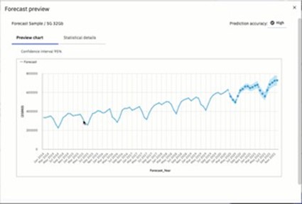
This opens up new and interesting ways of auto generating your forecasts, whether it be as a starting point for your planning cycle, or as a comparison to a traditional bottom or top down forecast submitted by your user base. This feature will evolve and continue to grow over the coming months.
NEW USER INTERFACE
If you’re already a Cognos Analytics user, the new UI will come as no surprise. The new IBM Carbon Design has now also been rolled into Planning Analytics.
On the home page, the tiles for folders and books have been replaced with 4 clearly defined quick launch options (depending on your access role these may be reduced). These are:
Applications and Plans, Reports and Analysis, Data and Models and Administration.
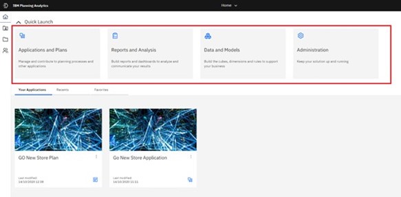
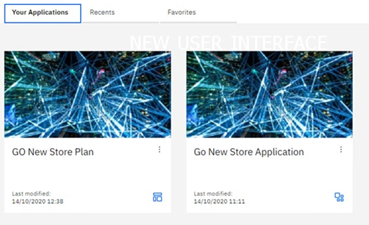
Any deployed applications will also appear in the lower half of the welcome page, alongside tabs for recently opened objects and any items the users have marked as a favorite.
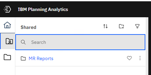
A pop-out sidebar allows users to browse the content store for both the Shared and Personal folders, whilst previously the user would have to switch back to the welcome page to open content, now this is always accessible no matter what you currently have open. Additional icons also appear depending upon what the user has selected, these include links to TM1 Databases, visualisations, and objects.
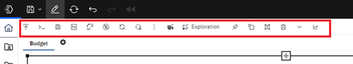
Finally, within the user interface, the old pop out toolbar has been decoupled from the views. Now whenever an object is selected on the page the toolbar will dynamically change depending on what has been selected, removing that slightly annoying search for the blue rectangle.
APPLICATIONS AND PLANS
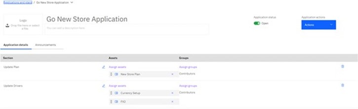
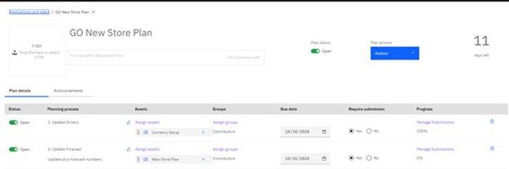
The guided planning functionality in PA workspace comes in two separate flavors in this new release. Instead of users having to open individual books and views to update their model, users can now create these in one or more Applications or Plans.
Both Applications and Plans are similar in the fact that you can create a flow of content on how your users should update their plans, whether that’s views, books, or websheets. The key difference between the two options is Applications do not have an approval and submissions process.
In the screenshots below you will see that the setup of applications and plans are identical when it comes to Sections, Assets and Groups. The plan diverges from applications where we introduce Due Dates, Require Submissions and Progress which basically shows how many of your groups have submitted their plans.
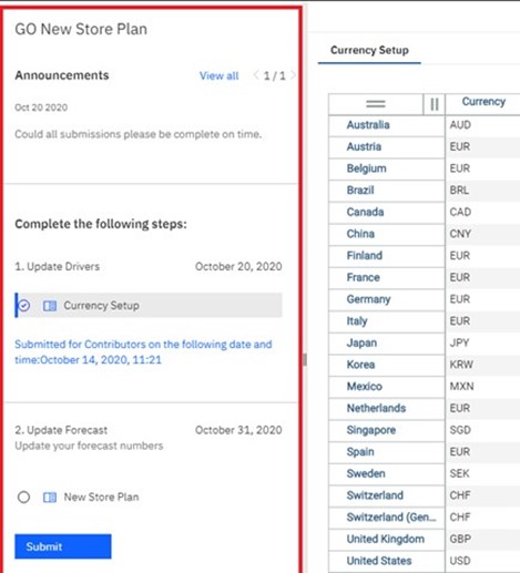
When opening your plan or applications as an end-user you will see a list of steps a user needs to undertake in order to complete their plan. It is also possible for owners of the applications to make announcements to all users within the application.
While this new feature isn’t the complete finished article just yet, it is a welcome move away from the rigidity of TM1 contributor and the static workflow dimensions that are forced upon you. In addition, we will see a move away from those pesky troublesome }tp cubes that were hidden away in the background.
NEW CHARTING AND VISUALISATIONS
In Workspace 57 & 58 the Charting Engine has had a complete overhaul and it now takes many components from Cognos Analytics dashboards.
The number of charts available to the end user has increased; these now include highly requested Waterfall chart and a few others that I’ve never even heard of before!
The construction of charts becomes more guided by the introduction of the field’s sidebar on the right of the page (see screenshot below), this will appear whenever a chart is selected. Depending upon the chart type it’s a drag and drop exercise to set your X and Y axes along with sub-categories, repeaters and filters. The guided approach and clear drop zones are a welcome addition as it makes chart creation a very simple and easy exercise.
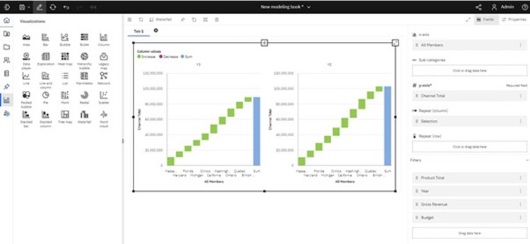
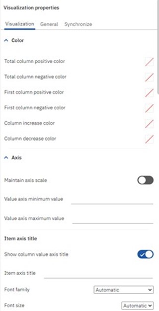
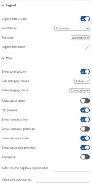
Alongside the fields control panel there is also a properties panel where you control everything from colour, sizing and fonts, to chart options, legend settings and labels. This is a big step up in functionality from the previous versions; I performed a quick count and concluded that there are around 90 different options you can tweak within the properties window, a subset of these are shown below.
*
IN CONCLUSION
In conclusion, I think the new features in Workspace are a significant step forward for the product, continuing IBM’s large investment in Planning Analytics.
I personally like the new Predictive and AI features, while they
are an initial step into this area initially, they are a sign of much bigger things to come. That said, even in this current release we can now get brand-new insights into your company’s data, creating second opinions or starting positions for forecasting the future.
Overall, the new user interface and guided chart design continues
to increase the functionally to end users. Historically the critics of the product said you needed developer skills to get the best use of tool, that is no longer the case.
The update has been released using two separate versions. Number 57 is the on-premise version and 58 is the cloud release. However, both are identical from an end user’s perspective.

Listed in:
- Planning Analytics
